| Home | Intermediate Workpage | Advanced Workpage |
| Tutorial Start | Intermediate Tutorial | |
| 1. | Beginning | |
| 2. | Headings | |
| 3. | Lists | |
| 4. | Images | |
| 5. | Tables | |
| 6. | Forms | |
| 7. | Beginning CSS | |
| 8. | Colors | |
| 9. | Text | |
| 10. | Margins | |
| 11. | Borders | |
| 12. | End of Beginner HTML/CSS |
They're teaching us about the paragraph tag.
Of course, I never follow the directions exactly because I'm a smartass like that
they also want to teach us about the emphasis and S T R O N G ! ! tags.
They're just other ways of saying italics and bold. Em is italics, strong is bold.
Except, they're not! The italics tag is still valid, as is bold.
You can use the line break tag to split two lines.
It's still one paragraph, so it looks different than if you were to use a new paragraph line!
Here you can see two line breaks, splitting this single paragraph element into three lines.
Onto the next part- headings!
This is the largest heading, h1! Say hi h1!
Headings get smaller the bigger the number goes up. (Note from Future Claire: The lower heading sizes became guinea pigs later. Don't worry about the weird exteriors.)
The sizes are irrelevant. That can be changed later, use the different headings to distinguish heirarchy.
The following is an excersize in using the ul (unordered list), ol (ordered list), and li (list item) tags.
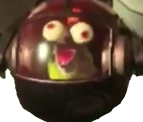
So, below is a random pic from my desktop... Even though I already did an Esther on the backside page.
This next one should take up about a third of your window. It also won't change size if you zoom in or out. That's an interesting little quirk, isn't it?
And finally... the fine explosion gif.

What a time to be alive.
Now we learn about tables. The first thing the tutorial mentions is how this has been historically abused to layout webpages, then tells us not to. Why is that the first thing you tell us, then?
First, I'm gonna copy/paste the starter table. Whole sumbitch. Here we go.
| Row 1, cell 1 | Row 1, cell 2 | Row 1, cell 3 |
| Row 2, cell 1 | Row 2, cell 2 | Row 2, cell 3 |
| Row 3, cell 1 | Row 3, cell 2 | Row 3, cell 3 |
| Row 4, cell 1 | Row 4, cell 2 | Row 4, cell 3 |
I'll be honest. I hate this. I don't think I'll be using tables much... I'll likely use CSS for those cases a lot.
...Shit, couldn't I use this to make a better directory to jump around these sections? Ugh. Yep, didn't last long. Here I go...
Oh, now here we GO! Here is the FINEST of HTML uses.
Except... without any understanding of PHP, it doesn't really matter. I can't do anything.
So here, have some radio buttons, I guess.
How do you rate the implementation of this input?
Hah, jokes on you. There's no submit button.
Kind of a sick joke to drop this on "beginners" without any understanding of PHP, imo.
Welp, that wraps up the beginner section. I've definitely learned a lot... including reading the damned documentation to get a full idea of the capabilities of any given element.
Tomorrow I start the intermediate portion, which will talk about CSS. Or maybe not tomorrow... I'm kind of intimidated by this. Well, when I'm ready, I'll just Click here to head to the intermediate portion
This portion is going to be a bit odd to show on this section, since it will be shown on the whole page! I'm going to use a distinct style.css file for this page. I'll be messing with the font size, type, and the background color. I don't want to re-use the dual-tone I've put on the main page. If you really want, you can look at the style page I'm using here, but that seems kind of silly. Still, there you go. Never say I don't do anything for you.
A lot of what I would do here is a part of the Hideous Quilt Experiment, and I don't really feel like repeating it. Yeah yeah, I can style specific elements, got it.
That said, I did take the liberty to make a different font for the headers vs the paragraphs. Serifed font (georgia) for the headers, and non-serifed (tahoma) for the paragraphs. Makes it a bit more readable.
the background color is a dun color since... I dunno, seems inoffensive, albeit a bit dull.
HTML Allows for a LOT of colors. I can use a wide range using the hex values (See: The Hideous Quilt Experiment), but there's also a pretty large selection of predefined colors. According to the tutorial, they are: aqua, black, blue, fuchsia, gray, green, lime, maroon, navy, olive, purple, red, silver, teal, white, and yellow. Color-coded for my immediate inconvenience. I'm sure that bit will be great to reference later, but that took a ton of mental energy to do. Future me, You're fucking welcome. Really, it was more practice for the span tag than anything. Still, handy!
It might seem odd to see "text" this far down in a tutorial, but there's a LOT to know about text and how you can modify it. For example, you can...
Make font bigger Make font smaller Make font just a little bolderAlign your text!How about words that are allcaps, but still typographically readable?You can even change the font on the fly!you keep forgetting to capitalize every word. let the style do it for you.Don't forget strikethroughs!Or something that does many things at once!Okay, some of these don't work so well in a list element.
Alignment, for example, works best in a paragraph element. See how this is in the center of the page?
Of course, if you wish to wax poetic and write some giant diatribe on the specifics of web development, you may wish to have the text indent for you. In which case, the "text-indent" property is here to help. Put it in your style css file, and anything it pertains to will get indented by the same amount, every time. This paragraph is just padding to show off the indent. What worth is an indent if the paragraph is only one line, anyways?
This text should be right-aligned.
Just... don't forget the hashtag when setting these up in you css file.
You'll note the header for this section is different; it's h3 rather than the h2 the others use. That's so that the padding can be formatted in the teststyle doc and not mess with the other sections. Sure, I could have done it inline, but that would have been wonky, so I've decided: I'll just use h3 as my guinea pig. The padding and element boxes have no defined color, so it stands out against the #a6a45a background of this page.
The tutorial references the "Box Model". I'd recreate it here, but that'd require more knowledge of containers and the "div" tag, and that comes later. I think. Suffice to say, there's four layers to each box: The element box, surrounded by the padding box, surrounded by the border box, surrounded by the margin box. You can define each box's specific sides to give ever more specific parameters.
Border classes can do neat things do. Behold!
There's a ton of different border options, and they deserve plenty of playtime. Far too many for right here. I'll get around to them. Or, they're around me? It was a stretch, but I tried.
This has been a very effective workpage to help me develop my HTML/CSS skills as I begin learning. However, it's becoming evidently clear that one page is not enough; especially as I continue to derp around, I'll want to periodically refresh my options so I don't need to worry about messing up everything I've done in the past. Plus, there's something cathartic to "starting anew", and making additional pages encourages me to bulk out my website instead of just making ever longer pages.
Therefore, I'm calling this one finished. I'll add a link to the new one here, or otherwise make it easy to navigate to. I may need to rework some of the webpage names. Regardless, thank you to anyone looking here! This has been a lot of fun. See you on the Intermediate Workpage!